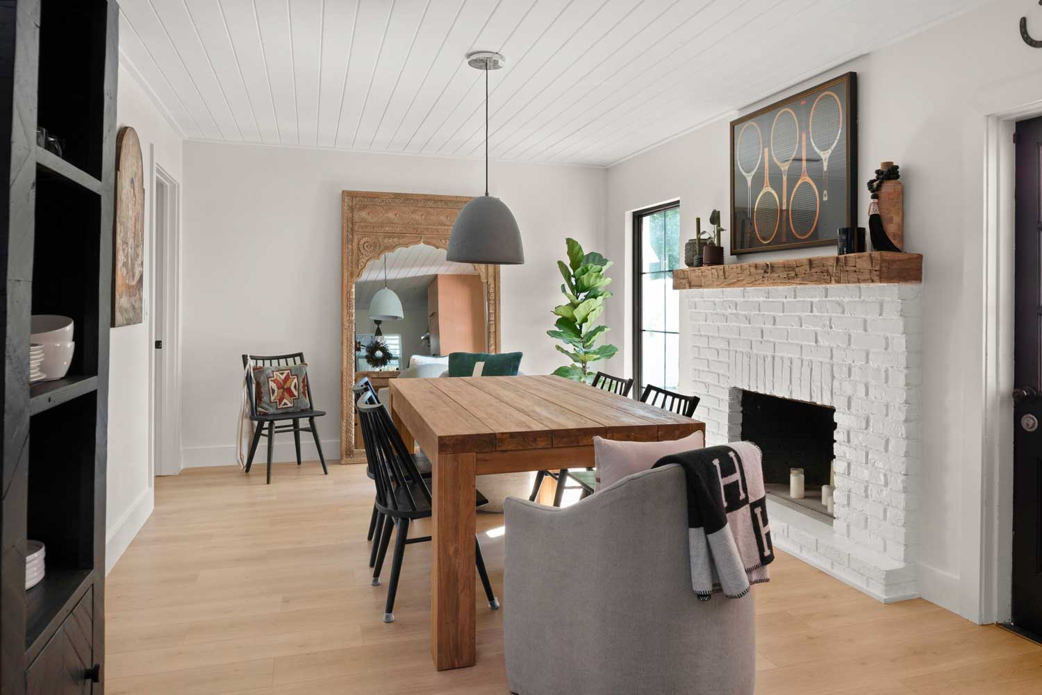
Clean lines, natural wood, creamy layers of color, lots of light, airy and modern vibes mix it up in an organic modern home remodel in Tampa, FL.
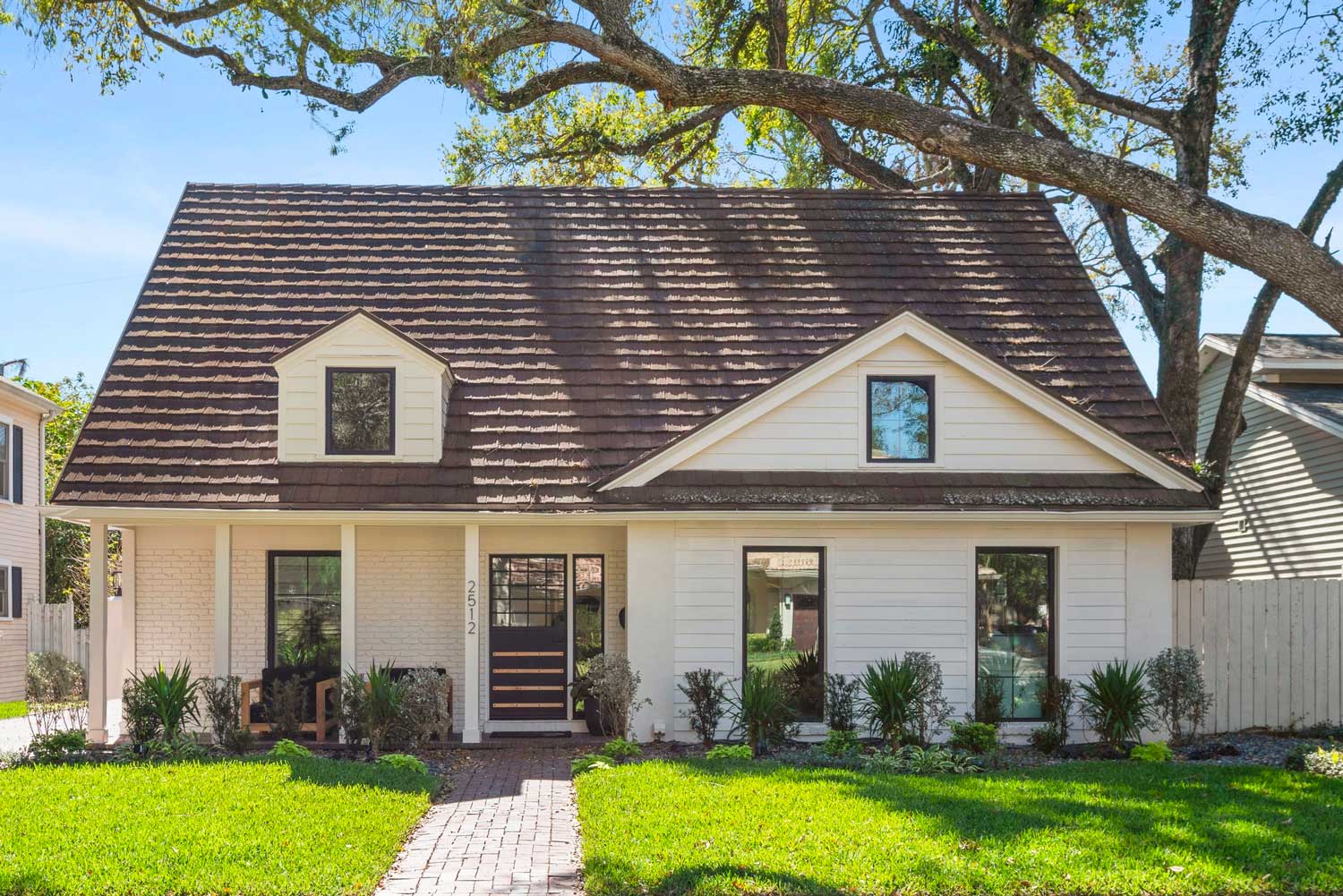
When local Tampa based influencer, Madison Messer, approached us about remodeling her new home, we were thrilled. Her 1960s cottage had been demoed inside and out – there was no kitchen, no bathrooms, no laundry room and very little flooring. A blank canvas is always a fun challenge!
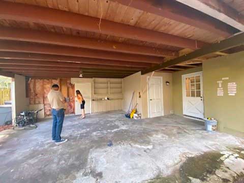

Madi told us her main goals were to give her aging house some life & light. The house was very compartmentalized with very little natural light getting to certain areas.
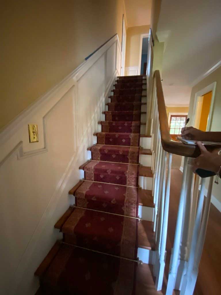
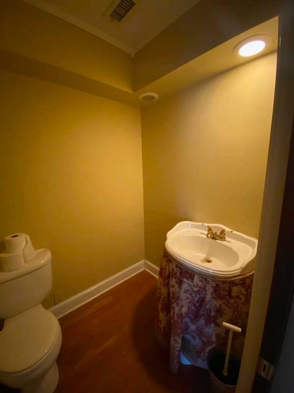
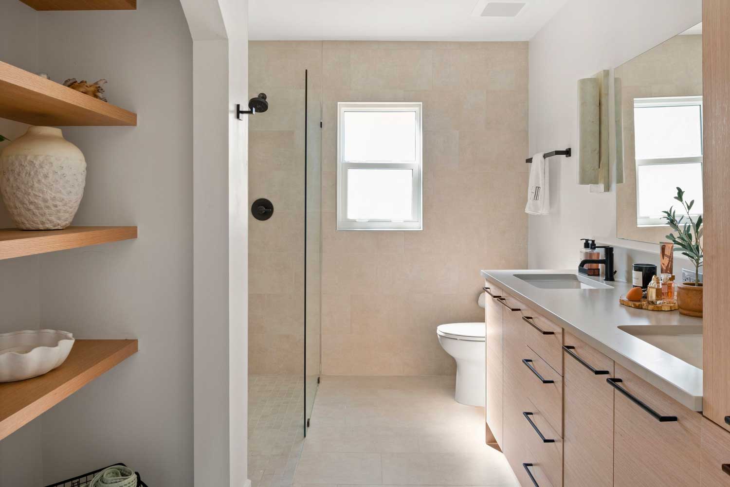
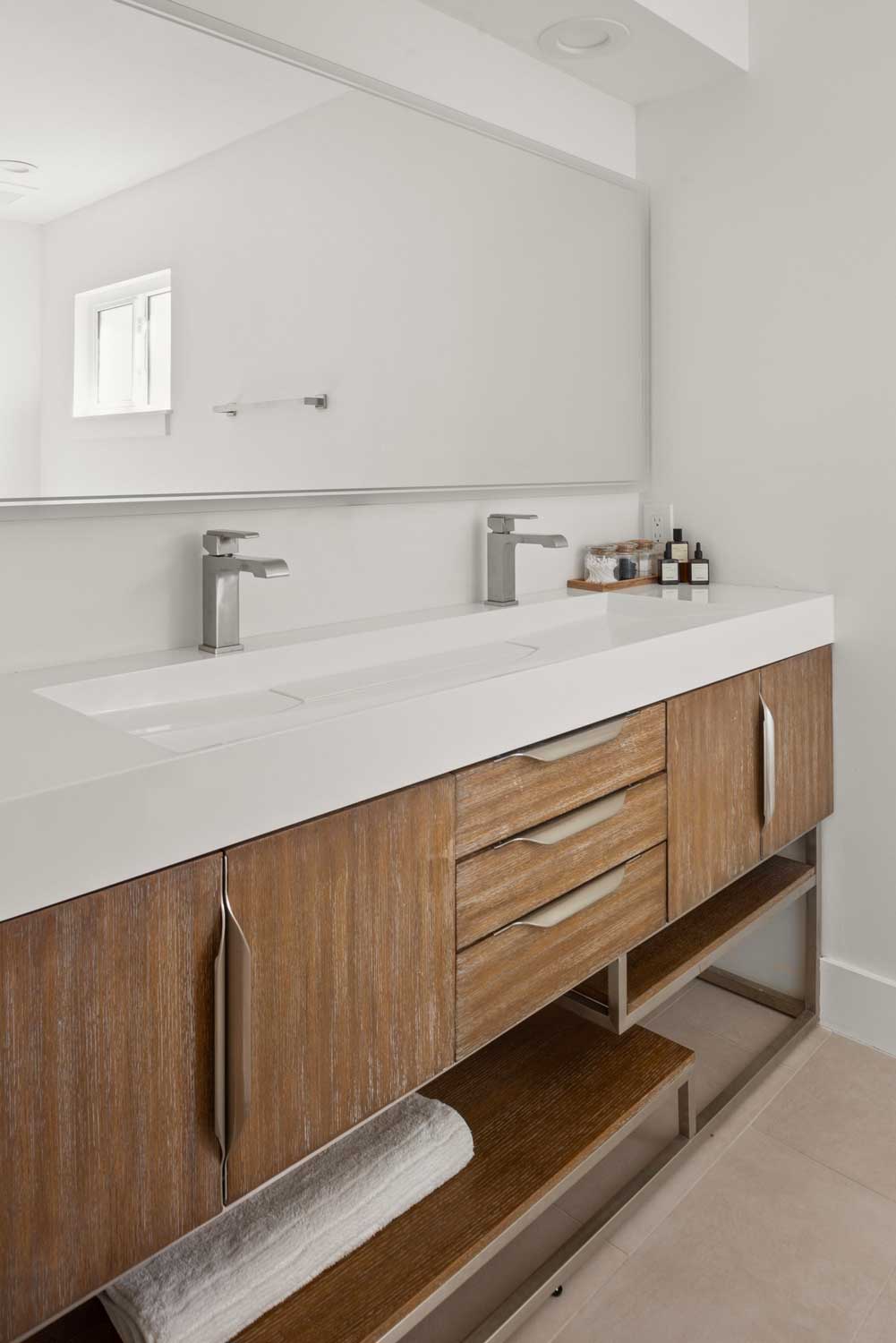
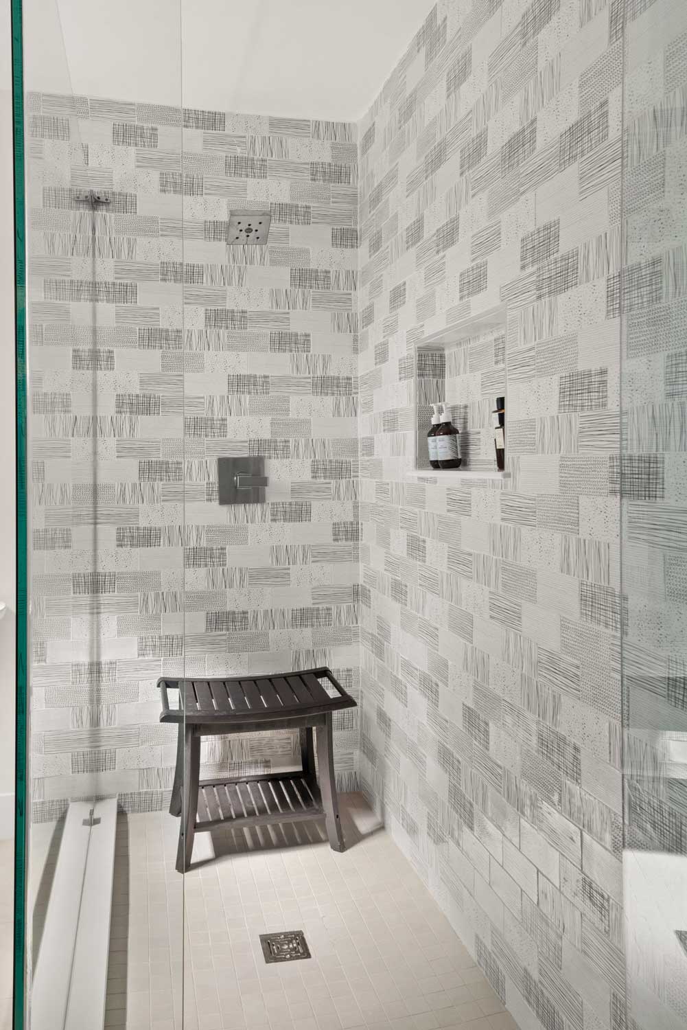
Madi wanted to create a modern yet livable space with lots of creamy colors and natural woods. Think of California modern… light and airy, yet you feel like you could work or use the rooms without feeling like you were in a museum. We needed to open walls and rethink how each space could function and be creative with some rather small bathroom areas.
S&W Designer Larissa Hicks tells us that working with Madi was a lot of fun! They connected instantly during their very first meeting which happened on the front stoop of the home because they got locked out! So, they sat out front just talking about her vision of what she wished the house could become. She had a realistic budget range to start and realistic expectations.
Not surprisingly she had a ton of ideas, a clear vision, and tons of inspiration photos, which Larissa absolutely loved. Not that a white kitchen isn’t a timeless choice, but Madi didn’t want that. She wanted a warm, yet overall light home including the kitchen, where she choose organic, natural materials and a beautiful forest green stove!
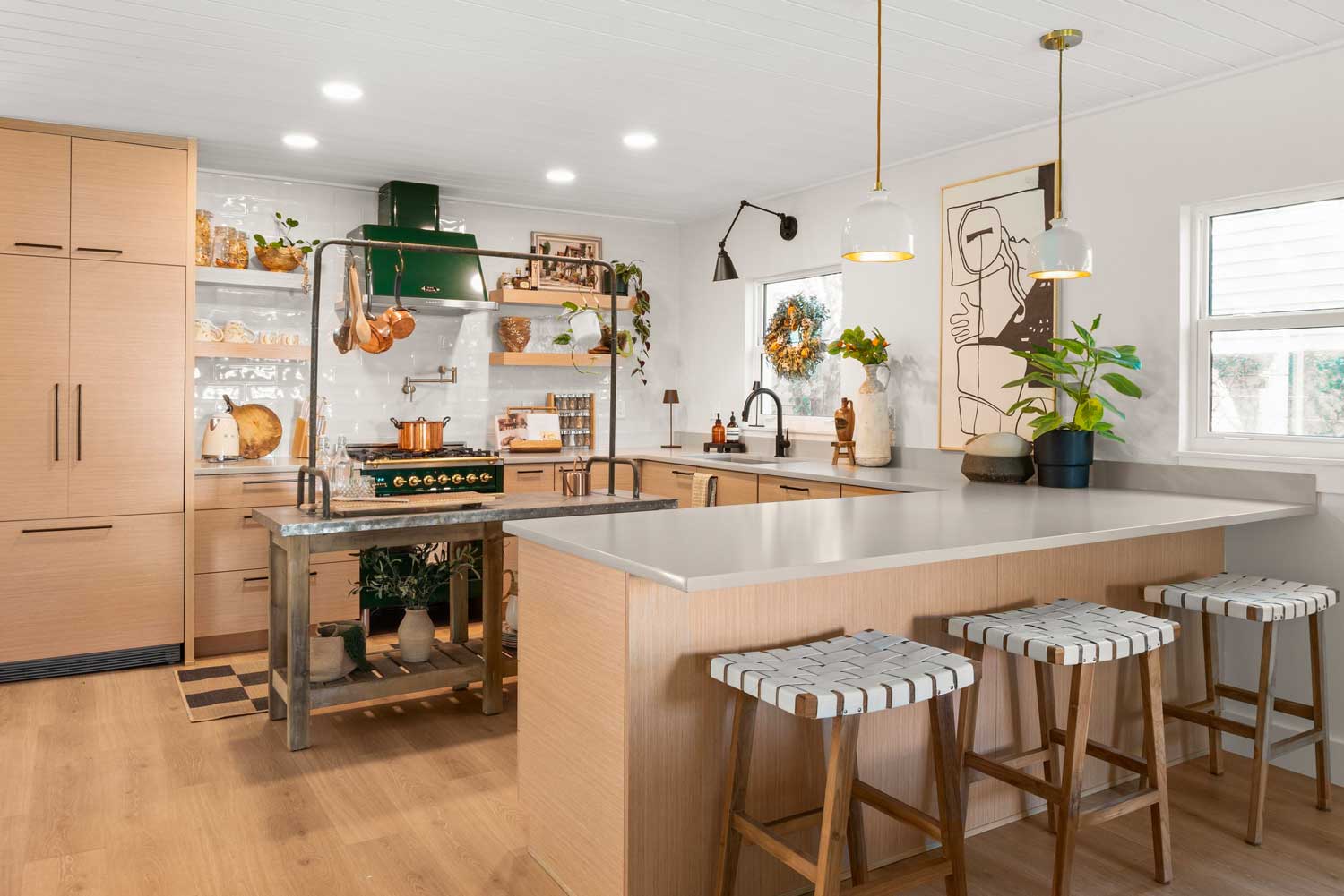
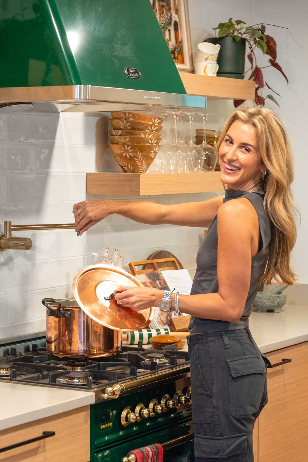
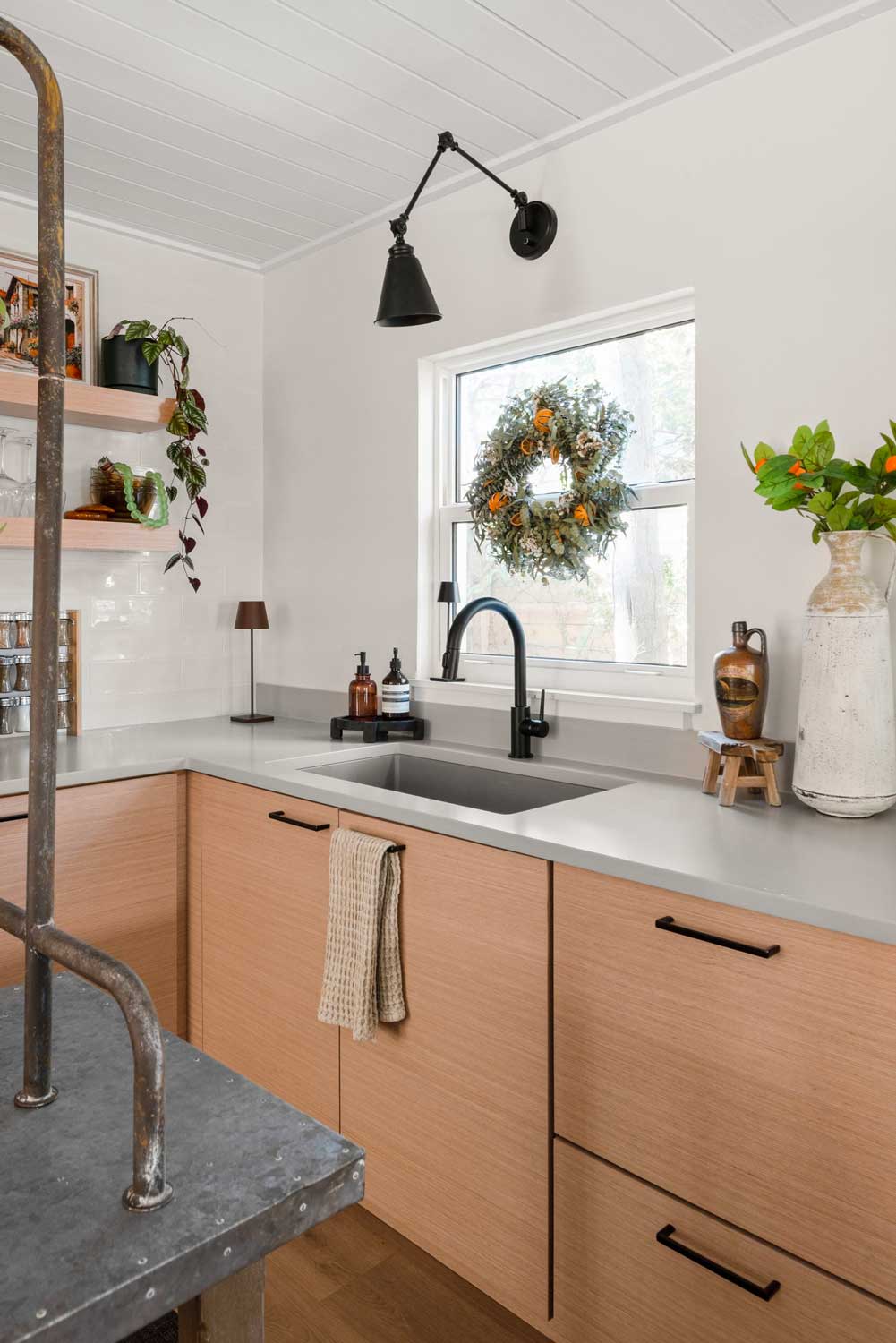
During the very first design meeting Larissa incorporated some of Madi’s layout and finish ideas with some of her own and voila! We came up with something amazing.

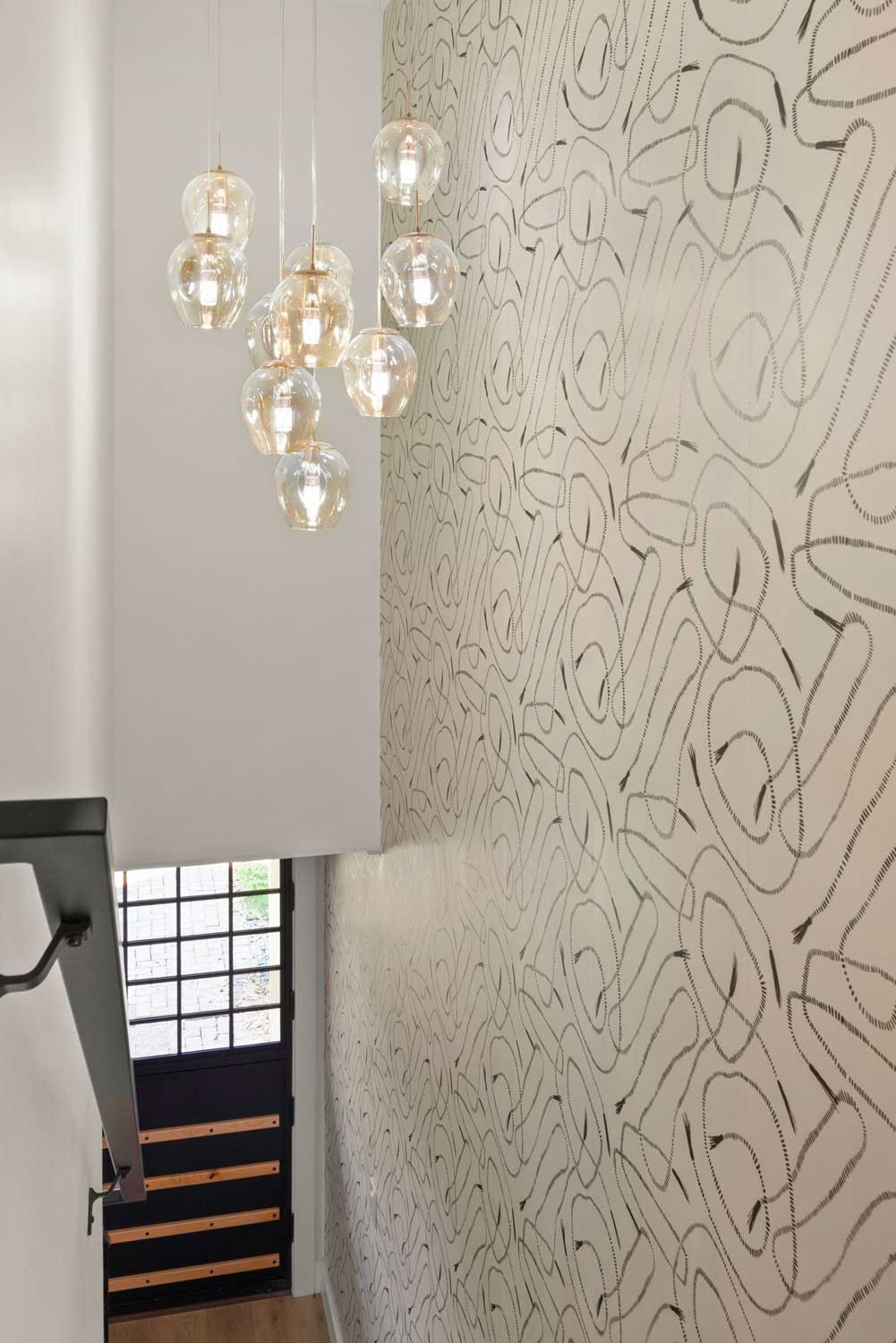
Along the way, Madi would find a photo of something she loved and sometimes text it to Larissa with “Can we do something like this or add it into the plan you came up with?”.
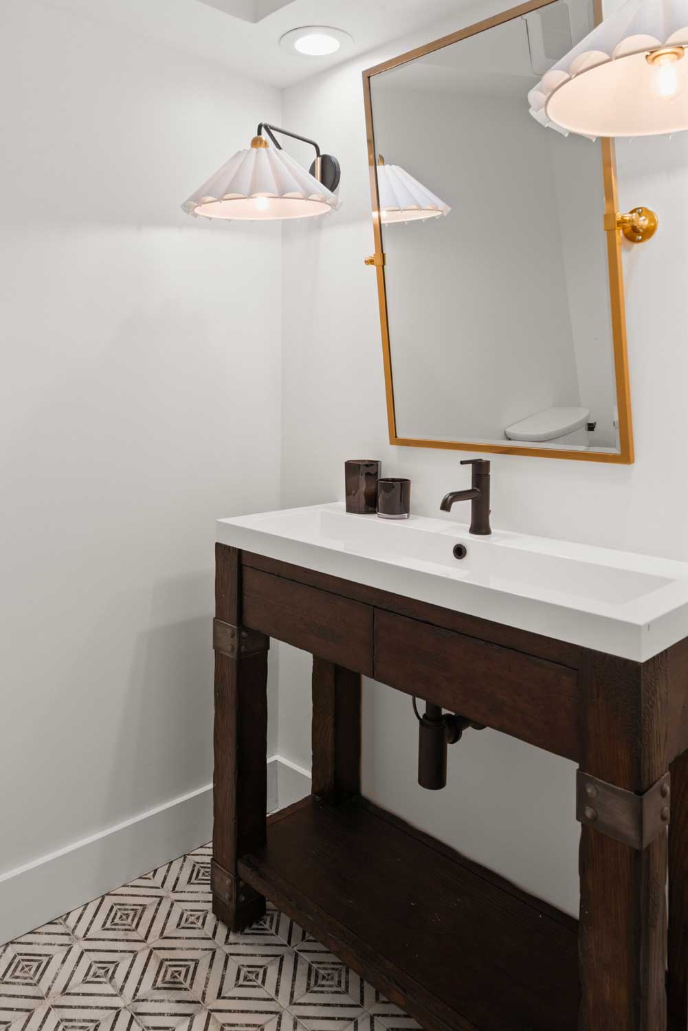
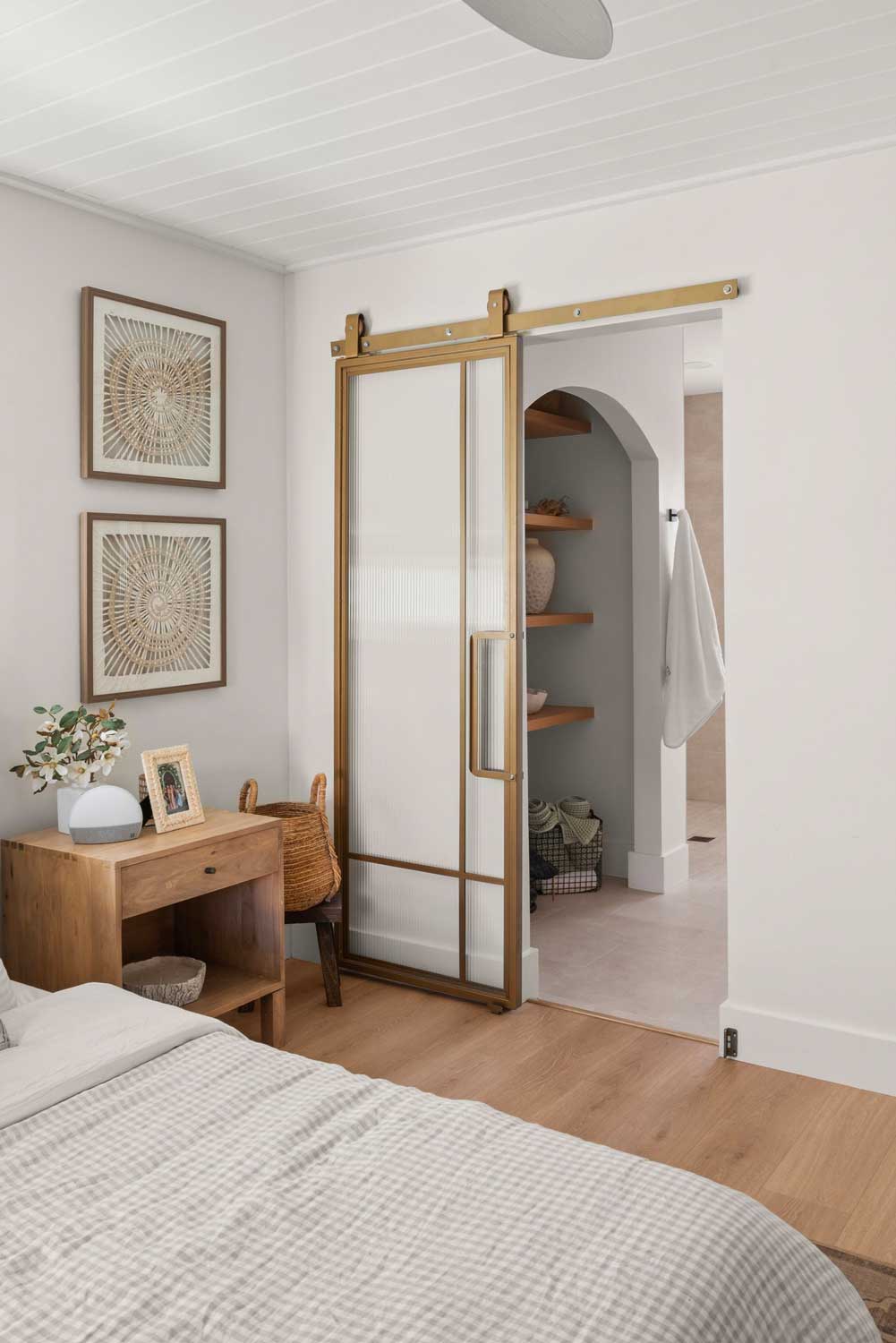
We constantly found ways to inject most her ideas and inspiration in a way that worked well for this home.
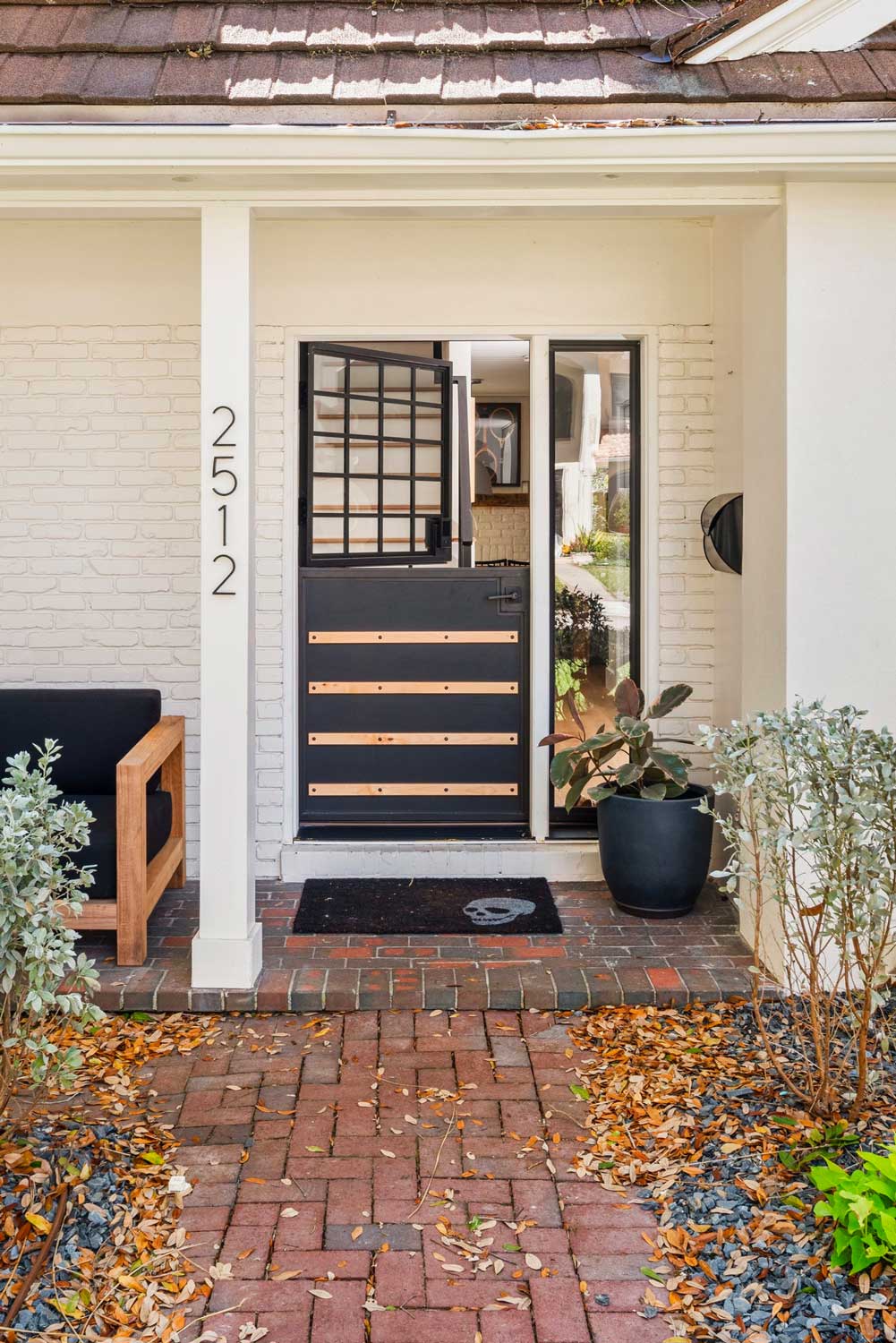
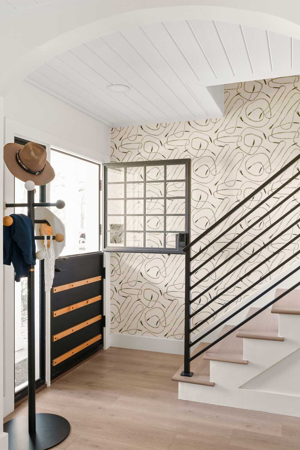
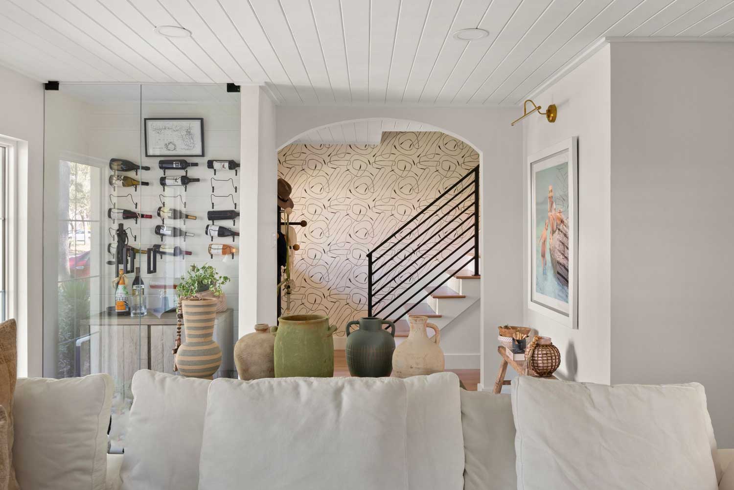
S&W Designer Larissa Hicks says, “I loved the way my design came together once we confirmed we could remove the load bearing wall between the kitchen and living space, then adding the texture of shiplap to the ceiling for depth. The wine bar add was one of my FAV’s! how amazing some glass, shiplap, and wine bottles can look. One of my favorite parts of the project is the entry: the combination of the custom Dutch door, the fun wallpaper, and the black handrail just looks stunning!”
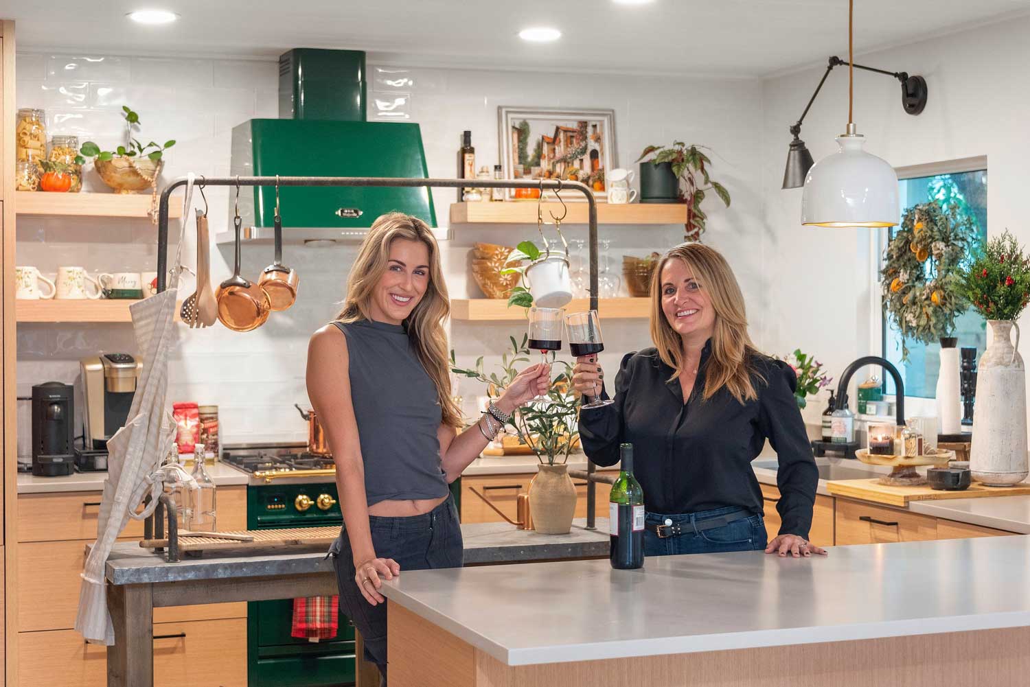
S&W Designer: Larissa Hicks – Tampa, FL
Featured Home: Madison Messer, @sweetteawithmadi
Get Inspired! Take a look at some of our other whole home remodel projects.
Ready to talk to a Designer? Schedule a Consultation.

