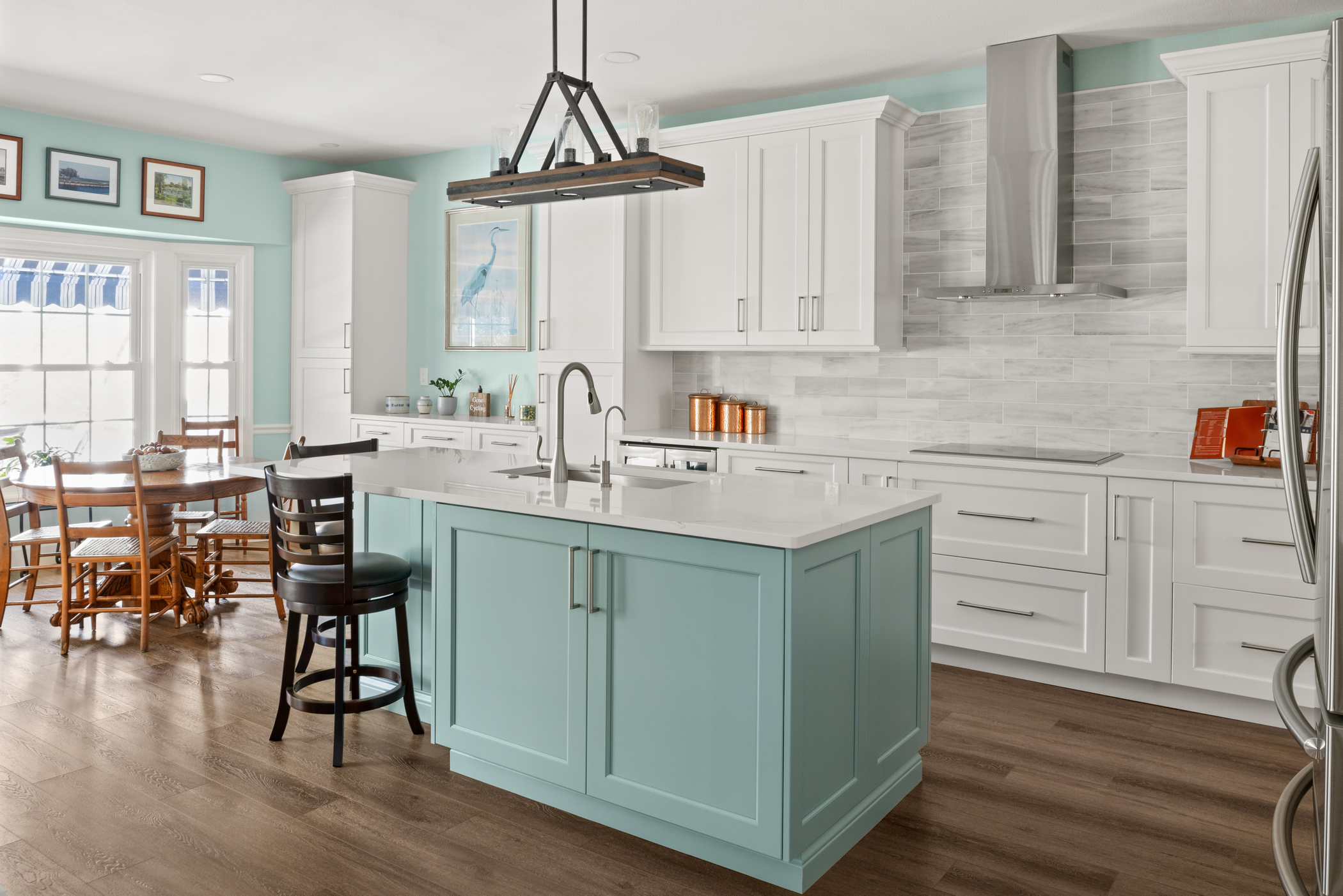
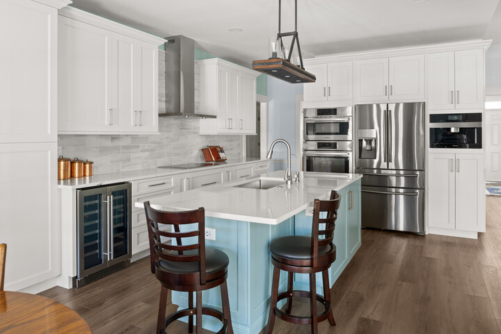
After buying a new home, this Tampa couple's builder told them to reach out to S&W Kitchens because they needed a designer to help them open up their space, make the home more functional, and add layers of colors to make the home fun and reflective of their personalities. .
Upon meeting them, they told us that the layout and flow of their home was all wrong. They had unnecessary walls blocking views of living spaces as is all to common with older Florida homes. They really wanted an open layout to help with the flow of their home.

Tampa designer, Larissa Hicks, was up for the challenge. She immediately clicked with the couple, and they had lots of laughs while picking out their colors and materials. The process went quickly because they knew exactly what they liked and didn’t like.
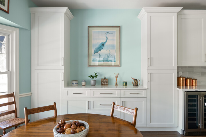
The appeal of timeless neutrals for their home was strong, but they also wanted to layer in color to make the kitchen update more fun. Larissa took a chance and showed them a much brighter blue tone for the kitchen island based on some artwork they had. They loved it, from there we were able to pick paint colors, etc.
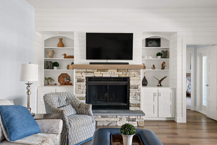
During the first week or so of construction, our team met at the house and we all stared at the elephant in the room -- the dated fireplace. We had briefly discussed it, but the clients were unsure of they wanted to do with it.
Before Photo - Living Room
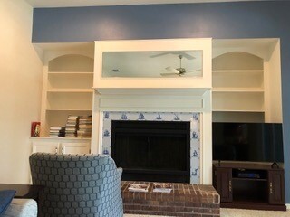
We brainstormed on the spot and talked about adding interest with shiplap as well as textures with stone, etc. One thing the wife didn’t want to budge on at first was moving the tv and getting a larger one to go above the fireplace. It took some convincing, but she caved and thank goodness because that opened up some beautiful design options.
Once we got her to agree we were able to adjust the side-built ins, the hearth, stone, and mantel. It turned out to be one of their favorite things in the whole project!
After Photo - Living Room
This whole home remodel also included the master bathroom and the laundry room.
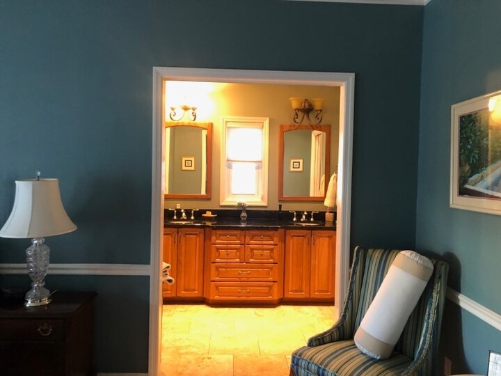
Before Photo - Master Bathroom
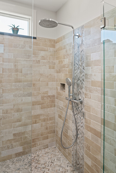
One time, just before everything approved, we were with the wife, looking at the final plumbing fixtures for the master bathroom. She loved the Hansgrohe shower column we showed her so they could have the rain head and hand shower on the unit. After she got home, she emailed us and said, “Bob hates it, I guess change it back to the others”.
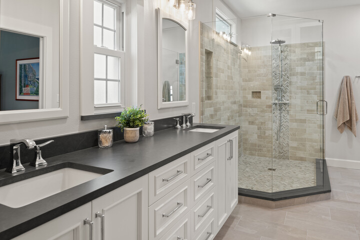
After Photo - Master Bathroom
Well, after we ordered everything, she called and said, “Bob changed his mind, can we still order it and return the other stuff?” Larissa was able to get everything exchanged in time to not delay, and what a great feature!
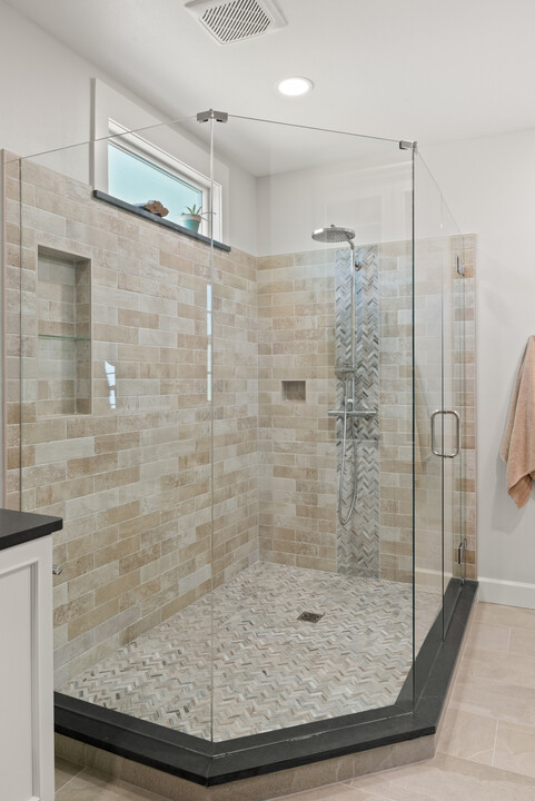
Here’s what designer Larissa Hicks had to say, “I absolutely love how we transformed the way you can interact now between the kitchen and family room. Being able to cook or clean while seeing this amazing fireplace has changed the way they use their home (for the better). My other favorite is the new floor plan of the master bath! It was very weird originally with the vanity looking like it was part of the master, completely cut off from the rest of the bath. "
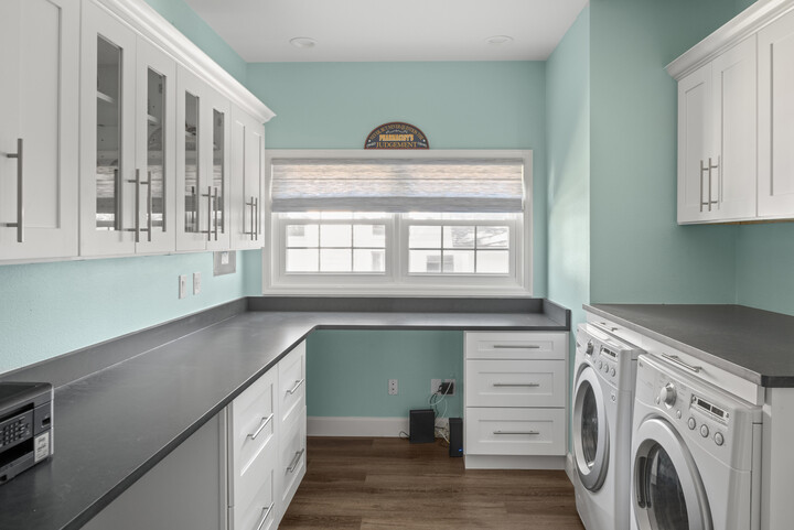
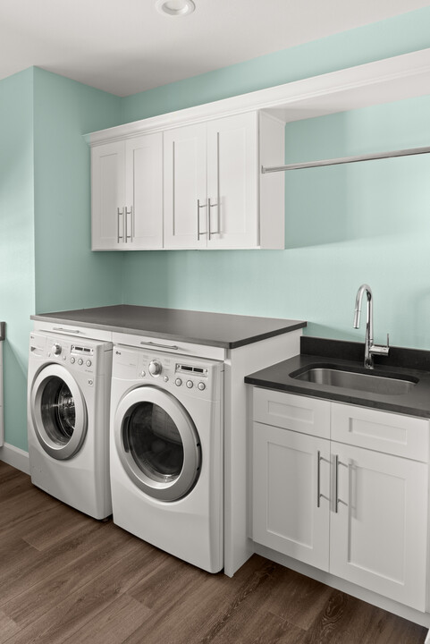
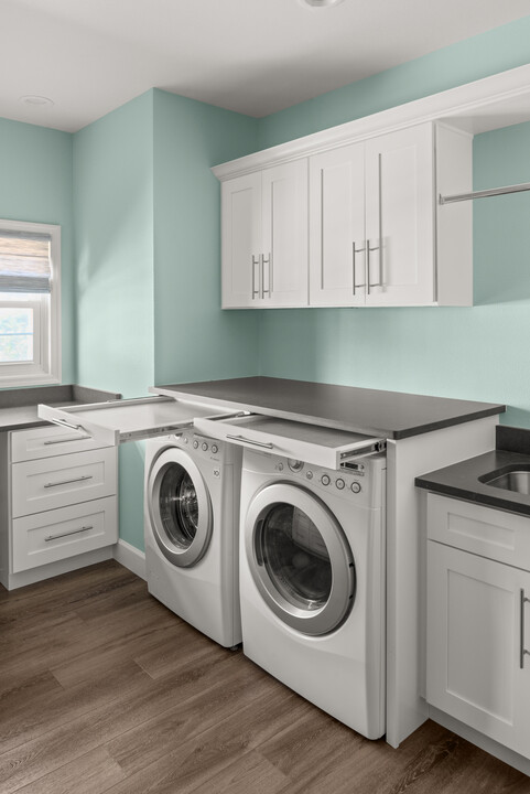
"OOOHHH, and the laundry room! The installer and I came up with these cool hidden drying racks that sit above her washer and dryer. Those drying racks were the most talked about and used part of the whole space! Loved how they came out.”-- S&W Designer Larissa Hicks, Tampa, Fl
For more home remodeling inspiration, visit our portfolio.
Ready to start planning your home remodel? Our consultations are free - Talk to a Designer

