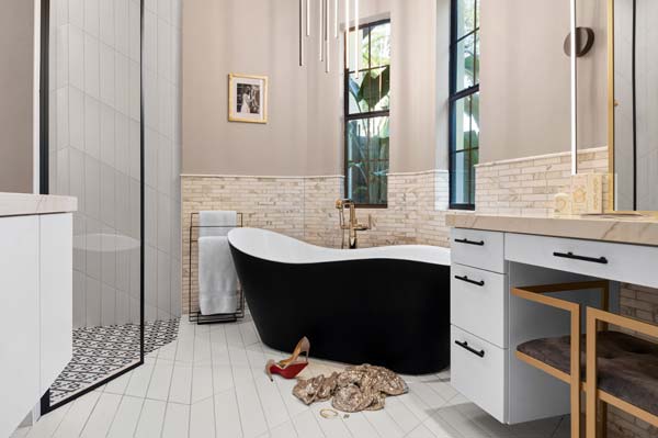
Learn how we designed a beautiful master bathroom that combines two styles seamlessly! Our client came to us wanting a beautiful, open and modern bathroom but was worried that style wouldn’t fit into their existing Winter Park, Fl Mediterranean style home. Luckily, designer Krista Agapito was up for the challenge!
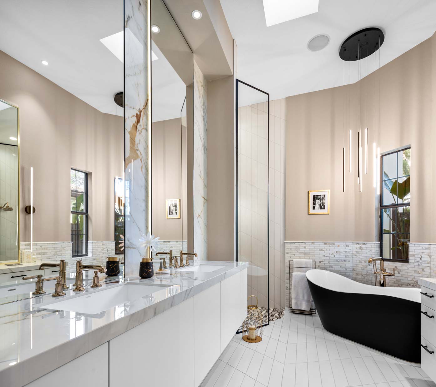
After years of modifying various aspects of their primary bathroom to better meet their needs, a couple decided it was time for a major overhaul. They got a referral from a neighbor and brought in S&W Kitchens to give them a modern look that could still fit within in their Mediterranean-style home.
"For clients, it’s so hard to see beyond the footprint they’re living in,” said Agapito. "They were working with what they had and what they thought they could do. As designers, we can come in and see the possibilities of the space."
Agapito had her work cut out for her because when the project started, the clients asked for a space that was sleek with lots of light, ample storage and a modern aesthetic, but they wanted her to deliver it while keeping their existing jetted bathtub and walk-in shower.
BEFORE PHOTO:
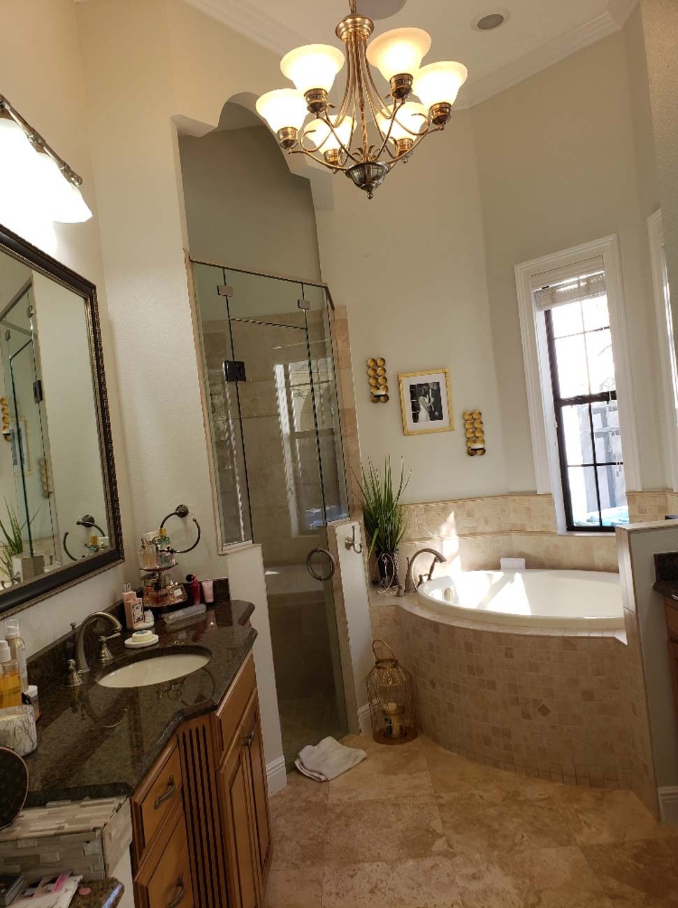
The bathroom was a long space with a sink on each side and the tub and shower at the far end. Agapito had to negotiate around the tub access panel, so she decided to move one sink to the other side and put the makeup table there instead, which would allow her to hide the tub plumbing behind the knee panel.
Working with the existing finishes meant blending a modern palette with the warm stone in the shower and on the tub surround. Without any extra tile to take to the showroom, Agapito brought materials to the site to see them in the space. She wanted to seamlessly bring in the white aesthetic the clients asked for while honoring the existing travertine.
"It helped us maintain a warm element in the porcelain slabs and the countertops,” she said. “In a way, maybe that was a good thing."
When the layout, materials and design were presented to the clients, they liked it so much, they decided to increase the scope of the project and asked Agapito to replace the big tub and deck with a freestanding version.
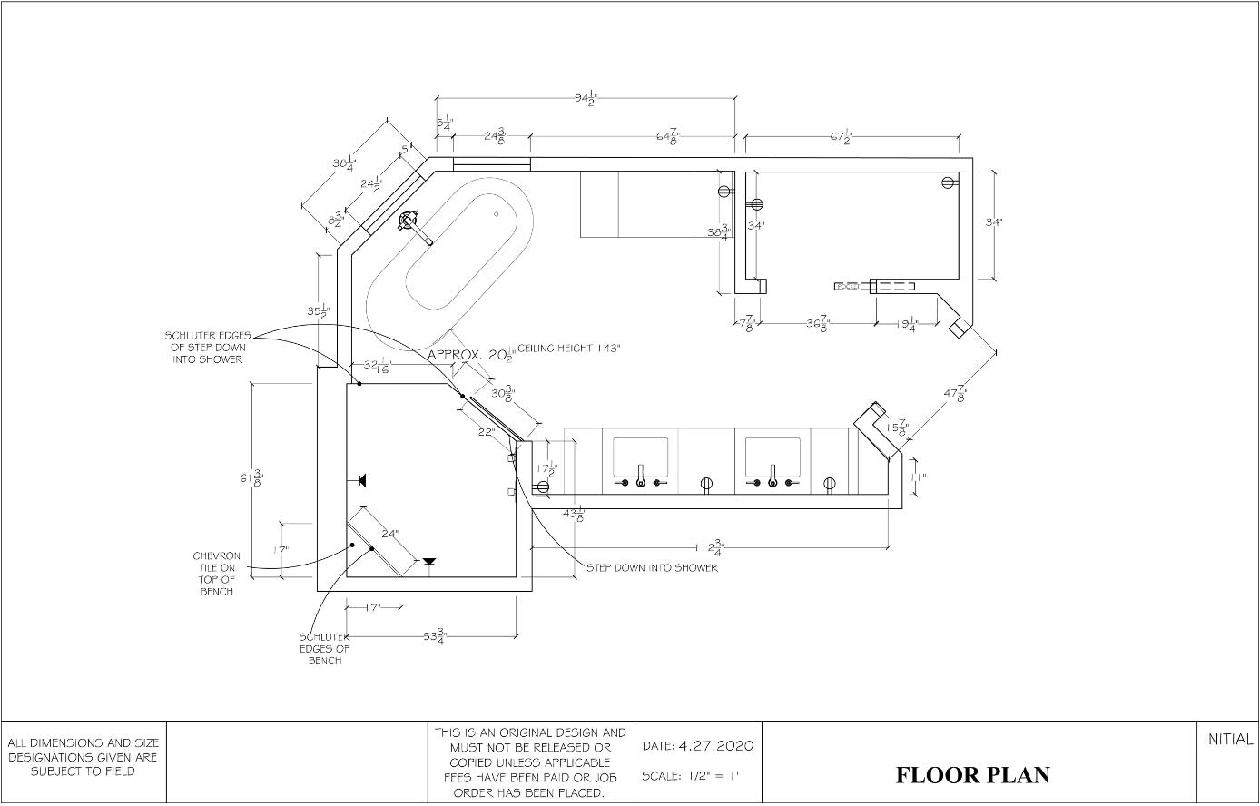
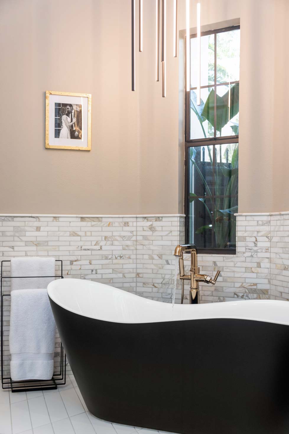
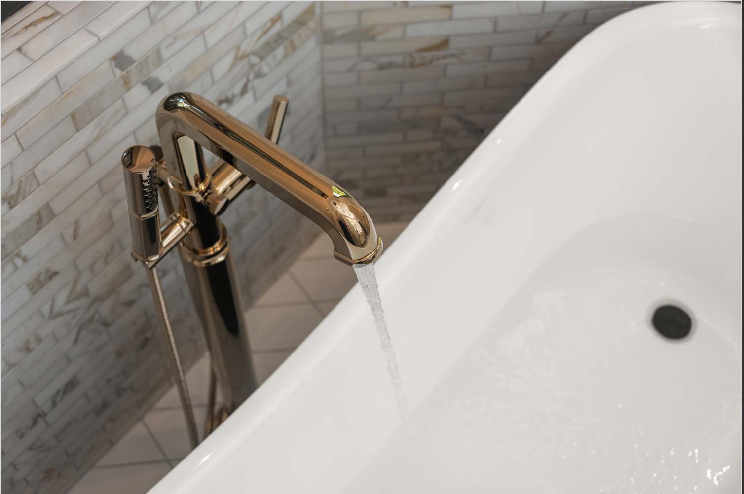
Construction was not yet underway when the clients changed their minds about the tub. Agapito reworked the design and specified a matte black slipper tub with a polished gold tub filler, a look that brought together the modern yet warm palette and added an element of contrast to the room. With the shower still in place, she had to find a way to blend in the wall where tub tile had been and specified a white tile with warm accents.
She moved forward with the project, ordered materials and submitted for permits. Then the clients came back with one more request – they wanted to include the shower in the project too.
What had begun as a partial bathroom renovation had become a full renovation, basically the gut job that would have made anything possible at the beginning. However, because she was already locked into products and materials that had been ordered, Agapito had to stay within the parameters she had chosen based on the earlier scope.
"Designing any room piece by piece can be very difficult,” she said. “Everything affects everything when you are designing a space you plan to build."
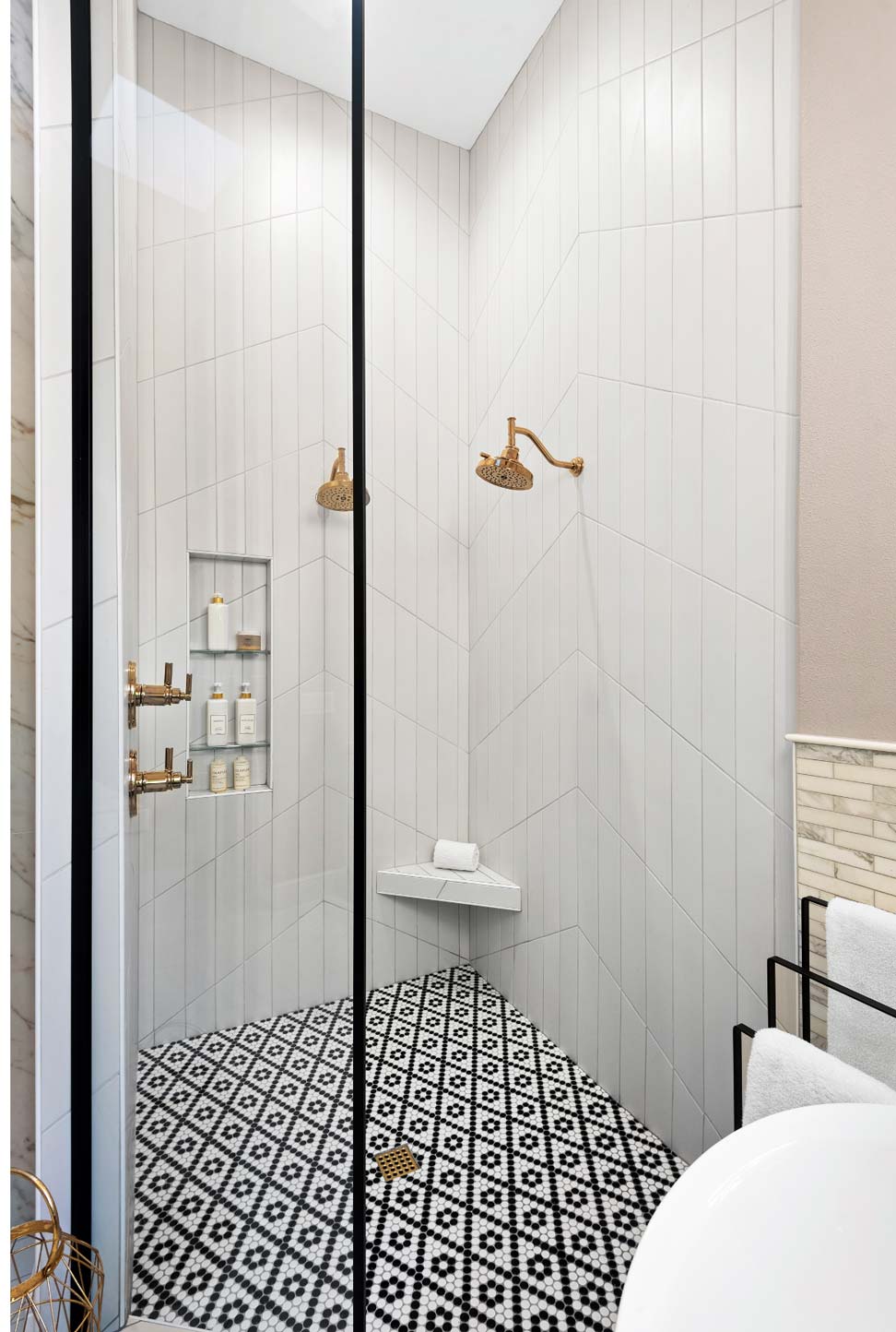
To incorporate the shower with the modern style, she took down the crown molding, adding visual height, and used the same chevron pattern of the main floor on the shower walls. A black-and-white pattern was used on the shower floor to bring in a hint of the contrast created by the tub.
Shifting course multiple times during the project required more than sourcing complementary materials and finishes. It also led to getting creative with the tile installation because of spatial and plumbing constraints.
In the shower tile, there is just one center seam line on each wall, but the walls had different dimensions. There are meeting points from one wall to the next and an apex in the middle of each wall, along with fixtures to contend with. In the end, the top of the apex on each chevron wall is a different height, which is not noticeable, but it would have been easy to spot if the seams had not meet from wall to wall.
"Some things are hard to see on a CAD drawing,” she said. “You plan, and the installer gets there, and it doesn’t work. This is why it’s so important to have a good team. Not one of us can do this by ourselves."
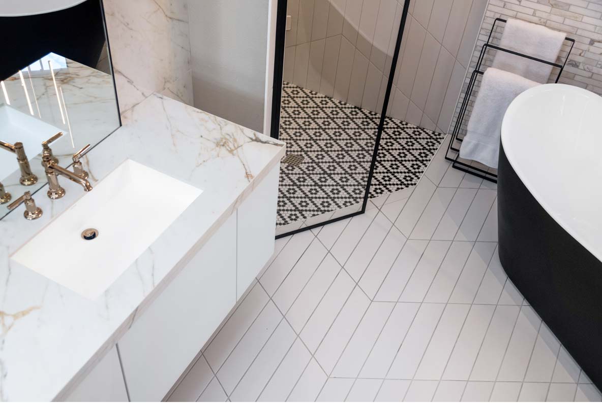
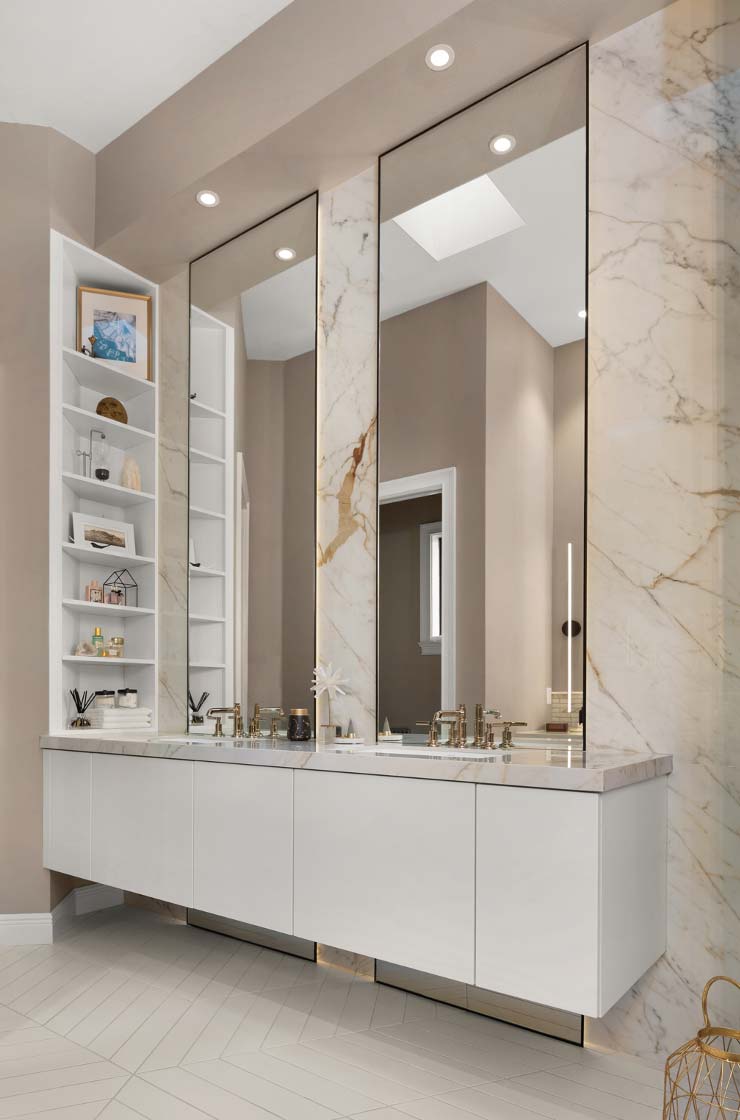
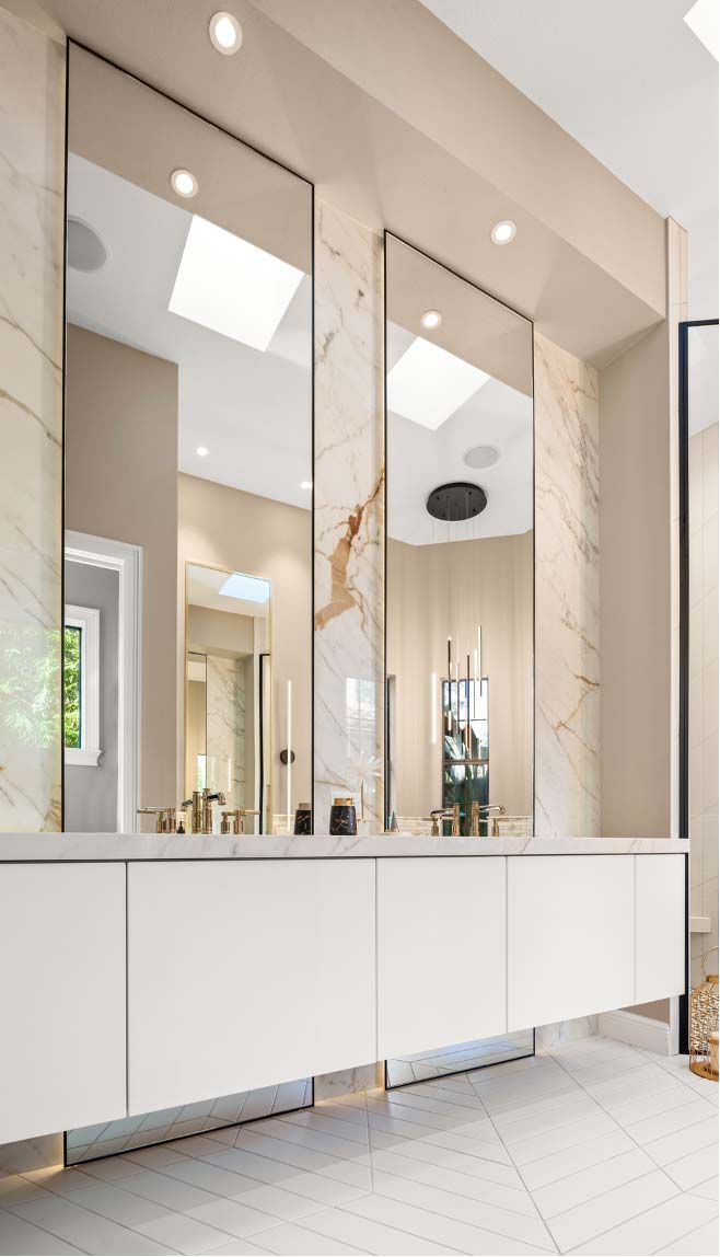
The clients wanted floating vanities, which was a good choice for this narrow bathroom and allowed Agapito to add backlighting to the mirrors and at the floor. This modern choice imparts elegance and a sense of more space.
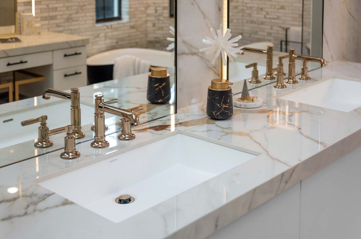
Brilliance Luxe Gold finish elevates the bathroom and brings in the warmth that was necessary when the project was based on keeping the original bathtub and shower.
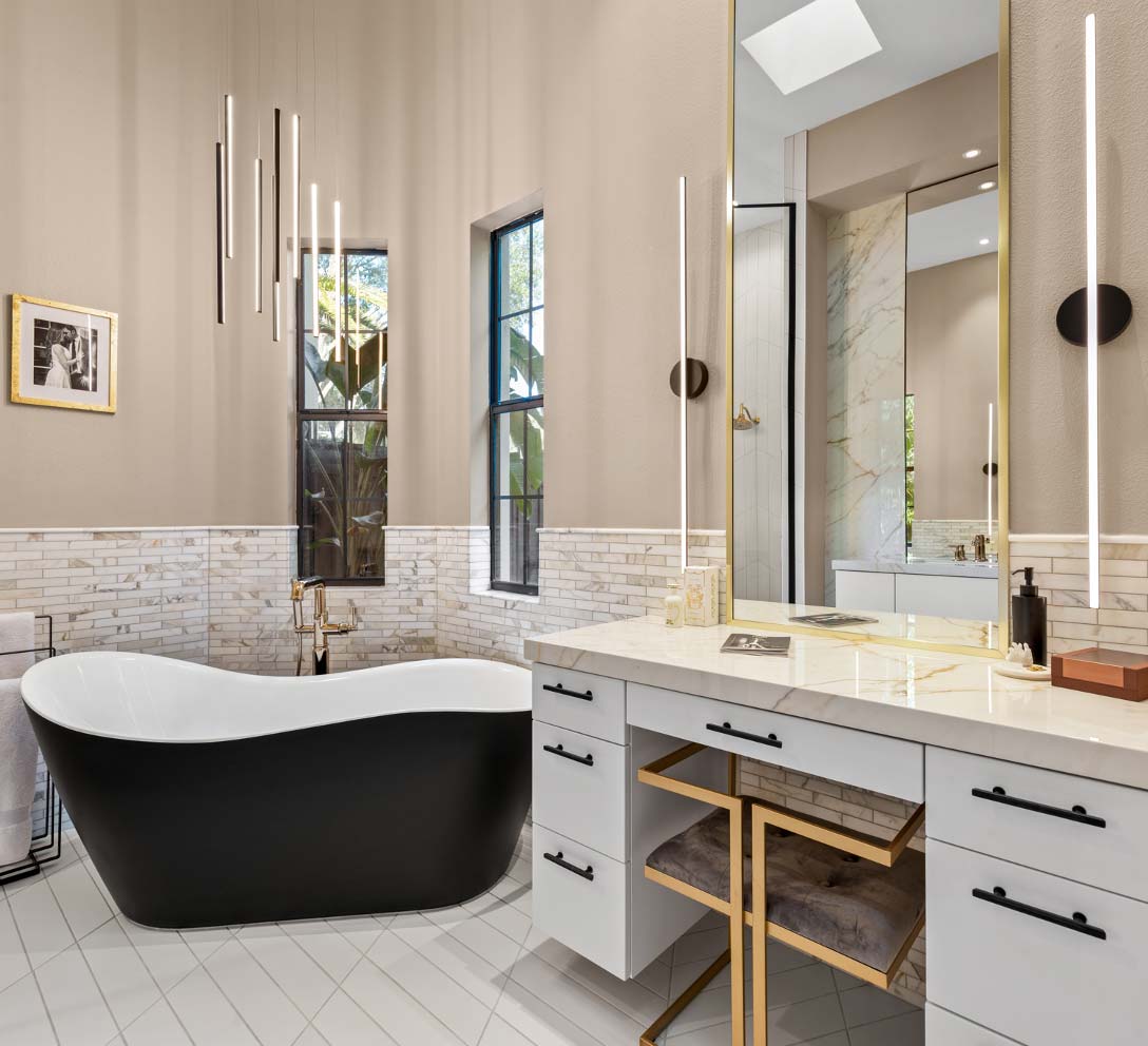
The suspension light was intended to hang above the center of the bathroom where a starburst pattern in the tile meets. But roof trusses required shifting skylights, and the lighting fixture went above the tub instead, where it looks like it was meant to be.

The bathroom walls were painted a taupe gray, which Agapito saw as the color summary of the space, the marriage of gray and warm tones.
Throughout the project, Agapito built value for her clients and moved them to a larger scope without pushing them. When they considered including more aspects of the bathroom in the renovation, she asked them to look at the difference in cost rather than the total. The question became whether the difference was worth it, and it was.
"I could have given them a great bathroom with that tub and shower, but it wouldn’t have been this bathroom,” she said.
S&W Designer: Krista Agapito, Winter Park
Ready to Design Your Bathroom? Talk to a Designer!

